This is a transcript of a talk delivered at Cognitive Cities, a conference on the future of cities held in Berlin on 26th Feb 2011.
Hello. I’m going to show you some research projects by myself and other colleagues at CASA, which concern what I call the living city.
What do I mean by ‘the living city’?
[ source ]
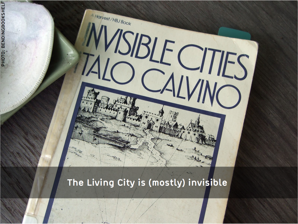
Cities are made up of physical networks of infrastructure, from buildings to roads and subway lines. But they are also made up of flows of people, vehicles, information and goods. It’s these cities of flow and networks of interaction which I call the living city. The living city is hard to spot, as it doesn’t tend to manifest itself in a tangible way. We move around cities. We interact with each other. But these actions leave little physical residue. The living city defines a multiplicity of invisible cities.
[ source ]
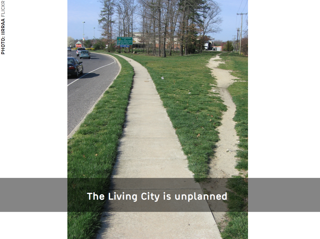
The living city is unplanned. In fact, we can define it precisely as those elements of urbanity that are unplanned. The so-called desire path here is the living city in conflict with the planned pavement. It’s a rare case of the living city leaving an obvious trace. For the most part, we need to pick up trails of digital data in order to understand the spaces produced by the dynamic interactions of many individuals with each other and with the city infrastructure. As a researcher, one of my tasks is to make this living city visible through data.
I’m going to talk about the living city today in terms of interactions, boundaries, flows and evolution.
Interactions
In this first project I’ve looked at the social life of cities. The city of social interactions.
[ large ]
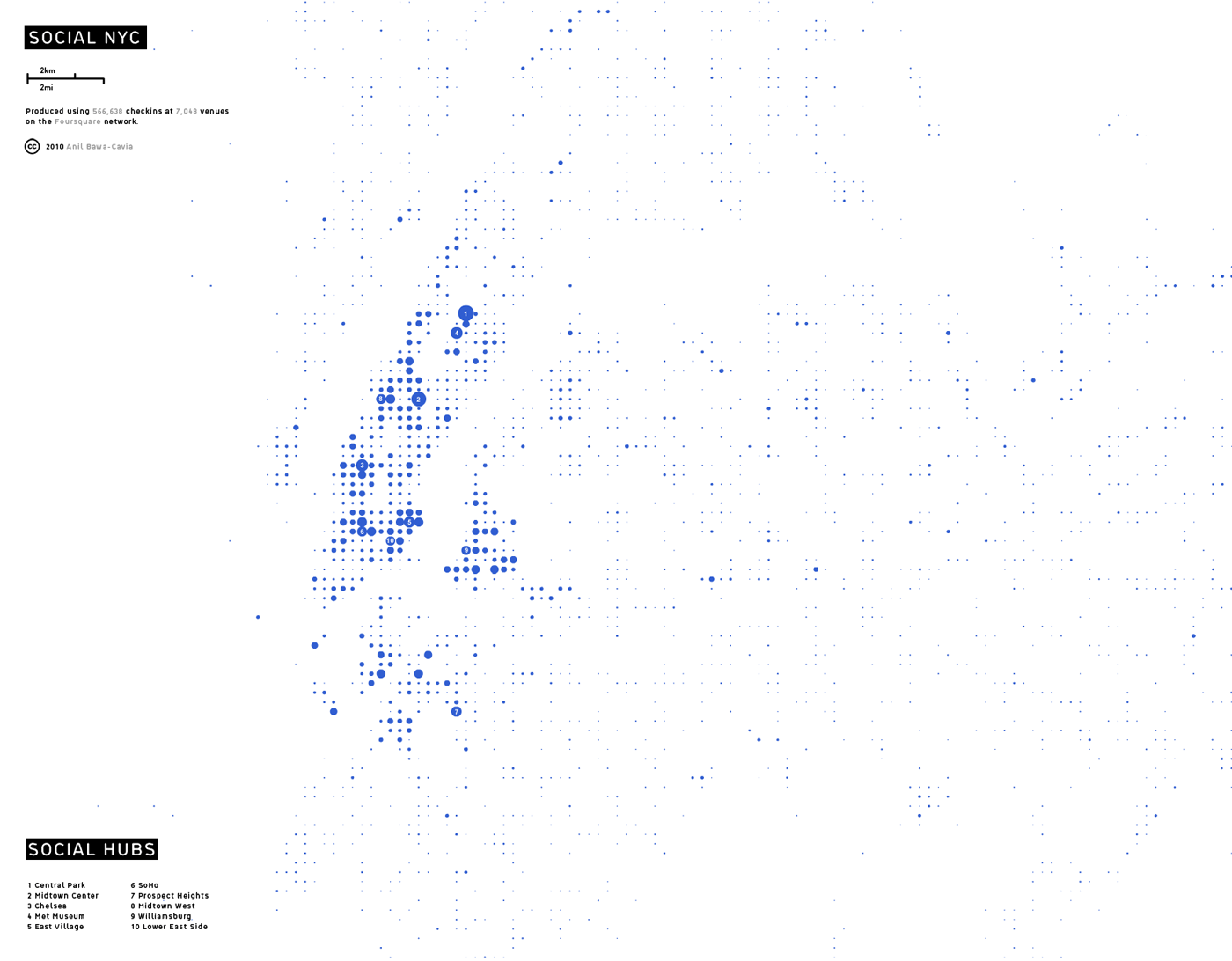
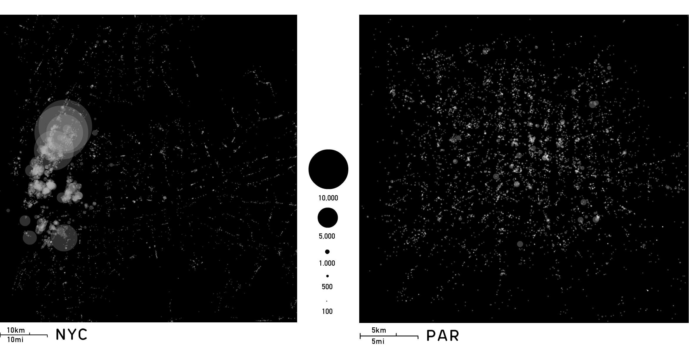
What I’ve done is produce bottom-up images of cities by mapping millions of events on Foursquare, a location based social network. This is an image of New York City constructed from 600,000 GPS events on the Foursquare network. Each event is a user checking-in to a social venue (a bar, restaurant, art gallery, nightclub, etc) on their mobile phone, in order to let their friends know where they are. Each dot represents a walkable cell of 400×400 meters and its size is proportional to Foursquare activity over a year. By this process, recognisable social hubs emerge. You can see Midtown, Central Park, Lower East Side, Williamsburg on here.
[ large ]
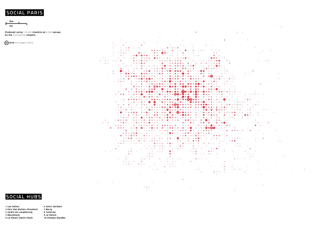
Here’s Paris. Again, you can see areas like Le Marais and Jardin du Luxembourg pop out. In these activity fingerprints, as I call them, we see a new image of the city emerge in terms of the density of social interactions. As smartphones begin to penetrate to the level of mobile phones, namely 90% in the UK, these could be considered quite comprehensive snapshots of activity in cities. This is just an aggregate snapshot: We’re only just beginning to look at the spatio-temporal aspect of this data, the dynamics of this kind of social activity.
[ large ]
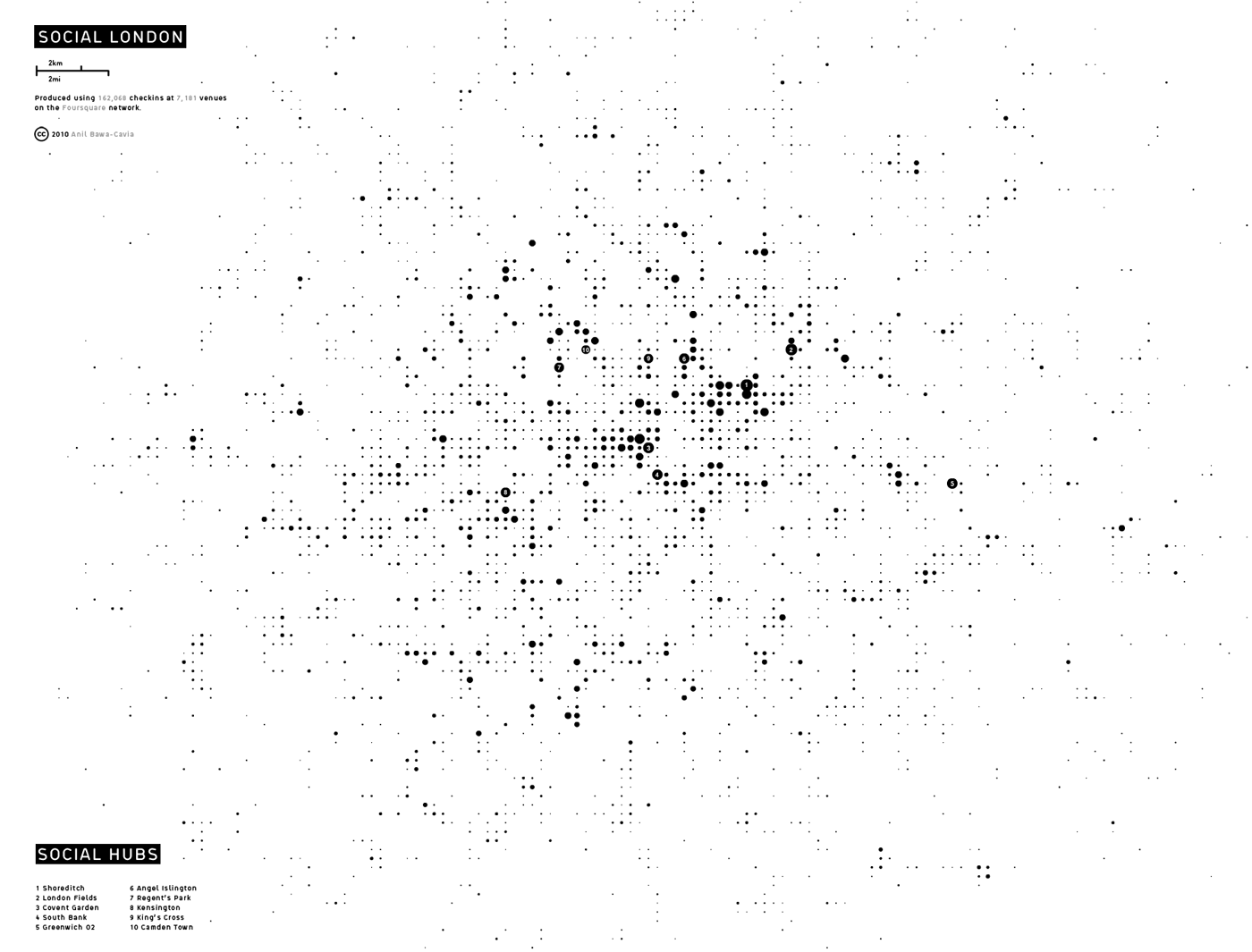
This fingerprint of London is a little more dispersed than the others, with areas like Shoreditch and Regents Park, Soho and London Fields, all showing up as centers of activity.
The fingerprints show how the city is actually used, not how it was planned or built. This kind of activity data builds on land use data from the land registry, which is all urban researchers have had to go on in the past.
Urban Activity Fingerprints · Visualisation of three western metropolises in terms of social interaction density · Anil Bawa-Cavia (2010)
[ large ]
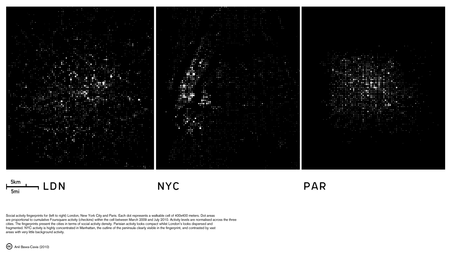
By using embodied measures, in this case the 400m cell, which is a comfortable 7 minute walk for most people, we can compare these social activity fingerprints across cities. I focus on the human body because it’s a constant across cities and comparative analysis needs such constants. The capacity of our bodies to move through space is fairly constant across cities, whereas most other aspects of cities are variable across different urbanisations.
I’ve produced a range of spatial analysis of this activity, exploring issues of interest to urbanism, such as polycentricity, centralisation and agglomeration. If we analyse spatial dispersion for example, London’s fingerprint shows a greater evidence of polycentricity, and Paris’ is the most compact and walkable. If we look at fragmentation, as I do in this image.
Fragmentation Studies
Relative fragmentation of social activity on the Foursquare social network across New York, London & Paris · Anil Bawa-Cavia (2010)
[ large ]
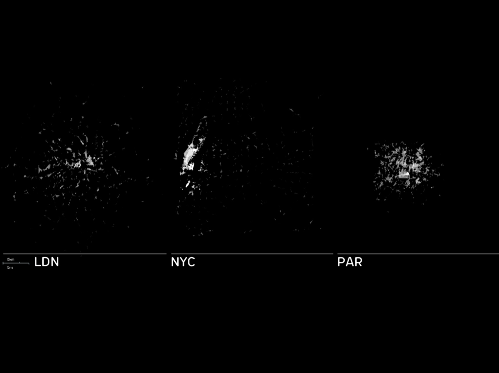
London and New York show far higher degrees of splintering in their social activity than Paris, which breaks down to far fewer, larger clusters of activity. This analysis is produced using DBScan, a spatial clustering algorithm. Each polygon is bounded by a cluster of venues, and its brightness is proportional to activity at those venues. Again the same embodied measure is used to define threshold distance in this fragmentation analysis, because the city feels fragmented to the individual if one can’t walk between locations - our image of the city is splintered by unwalkable distances.
[ large ]
Here we see each social venue in a city as a translucent dot, so every restaurant, bar, nightclub and art gallery in the dataset is represented here, with dot diameter proportional to activity at that location. The brightness shows us activity intensity. You can see a heavy concentration of activity in New York around Manhattan, and the decentralised profile of Paris, in which activity tends to settle along axial and radial lines, often corresponding to avenues and boulevards in the city.
We can use this research to start quantifying qualitative terms such as ‘sprawl’ or ‘segregation’, in terms of human interactions. New York is characterised by vast areas with very low background activity, and we can begin to look into correlations between activity levels and land-use for example. A lot of these low activity areas are known as relatively single-use residential which are typically called ‘sprawl’.
On the Parisian fingerprint we see aspects of segregation, as activity falls away beyond the péripheriqué ring road, meaning these smartphone users are socialising in under a quarter of the unité urbaine that defines Paris.
(You can see more of this project on the Archipelago page).
Boundaries
As social beings, we are predisposed to group ourselves into communities and even cliques. We can detect these invisible boundaries in the living city using communications data.
[ source ]
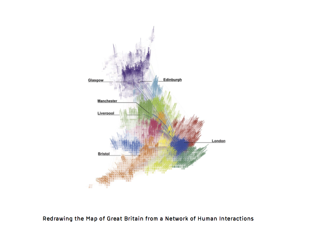
This map of the UK is composed of regions produced solely using phone call data. Billions of phone calls are analysed in order to draw these new boundaries based on communication patterns. In some cases they correspond to topographic or political boundaries but in some cases they don’t. The analysis of this network of interactions was a collaboration between my colleague Jon Reades and the MIT Senseable City Lab.
Here’s a short video from the research group.
[ source ]
The team used community detection methods from network science to partition all the callers into communities based on the phone call network. This analysis can also be produced at the urban scale. [ more here ]
Flows
Increasingly we leave traces of movement, from GPS enabled devices and RFID transport cards, or ‘wired’ infrastructure.
[ source ]
I’ve been producing what I call ‘flowprints’ of cities. These visualise the city of flows. This is a flowprint of the London Bus network, which contains about 30,000 bus stops. Each dot is a bus adhering to one of 700 routes on the network. I’ve used simulated flows in this flowprint, incrementally adding more and more buses evenly to each route, in order to show certain properties of the network structure.
I keep adding buses till we reach about 8000, which is the actual size of the London bus fleet. The brighter areas are where routes overlap or converge. These tend to be bus depots around the outskirts of the city, or the core of the network, which you can see in the middle. This is the historical center of the network, around Victoria, and a great example of what complexity scientists call ‘path dependence’: the capacity for small decisions or events to take a complex system in a completely different direction, constraining and dictating its future growth, disproportionately influencing its future. Because of location choices made 150 years ago in 1860, the network evolved around Victoria Station as its center, and to this day it contains the highest convergence of routes on the network.
These flowprints are like ‘macroscopes’ for cities. They allow me to look at the dynamics of the whole city functioning at once whilst preserving a high level of detail.
[ source ]

We can use Oyster data to produce flowprints based on real flows of passengers on the London Transport network. Here we see the London Underground network. Along the top you see a typical weekday and along the bottom a weekend. The graph shows activity on the network, and you can see how weekday flows are characterised by the double-humped dynamic produced by commuting. The first hump, which peaks at about 8:40AM is far steeper than the second one, which peaks just after 6pm. This implies that Londoners all go to work at about the same time, but come home at a range of times between 17:30 and 19:00PM, presumably based on whether they go out for a pint after work, which Londoners are renowned for doing.
Along the bottom you see a Saturday which shows much lower use, but rises slowly till a peak around 6pm.
By visualising the flowprints throughout the day we can see them expand during rush hours, long tendrils reaching far up into London’s suburbs (or metroland), and then contract during the day, in which only really the central portion of the network is in use.
[ source ]
Here you can see the london underground flowprint in action. Each trail is produced by an individual passenger touching in and out using their Oyster card. We construct a route for each journey based on a simple shortest path algorithm. This is necessary because we only have origin and destination data from the system.
Here we see the expansion of the flowprint as we reach morning rush hour, with these long tendrils heading northwards, the metropolitan, victoria, northern and central lines. London functions as a network of suburban villages and this underground network was designed to bring people into central london over a long distance.
We see the pulse of the city in this expansion/contraction movement. These diurnal patterns are the strongest signatures of the living city, in that they apply to most large cities in the world. We are analysing large-scale Oyster data sets (200M+ trips) at the moment, to help the transport authority understand how large groups of people react to disruption events. There are on average 200 simultaneous disruptions to the London transport network, so it’s always in an imperfect state.
[ source ]
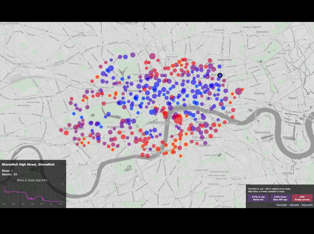
We’ve been working with flow data from the London Cycle Hire scheme, known to Londoners as the Boris Bikes. This is a screenshot of a real-time bike hire usage map available online. We have these interactive maps for about thirty cities with hire schemes. You can select any bike station to see its recent usage history and whether there’s any bikes available right now. In this visual, the red nodes are bike stands full of bikes, and the blue nodes are empty, so this is taken from the end of the day, after commuters have cycled back out.
This map was produced by Ollie O’Brien at CASA, using openlayers and openstreetmap, two open web mapping technologies.
[ large ]
If we examine the underlying flow network for the cycle scheme, we can see where the flows are concentrated. The edge weights of this graph relate to the volume of flow between two bike stands.
The two strongest nodes, which also act as hubs with high numbers of connections, are King’s Cross in the North and The South Bank in the center. These aren’t big destinations in themselves, they are transport hubs, interchanges. This implies that people are using the bikes as part of a multi-modal trip involving either rail or tube, which is encouraging as this could help to ‘distribute’ the rush hour peak we saw in the earlier Oyster data amongst different modes.
Activity is heavily concentrated in the East of London, and this is reflected in the bike stand provisioning, which slightly favours this part of the City. West London is generally speaking more affluent, with more car owners and better subway provisioning. The cycle network is designed as a kind of mesh, a point-to-point topology that doesn’t privilege any one node.
The quadrangle cluster in the West is Hyde Park, and these are the most popular bike stands on weekends.
We can use the usage data to understand precisely the kind of trips people take on bikes. It turns out the modal trip frequency occurs at 800m or about a 10 minute bike ride. It seems distances lower than 600m or so are largely deemed walkable, which backs up finding from other research, which takes 400m to be a comfortable walking distance in an urban context.
Evolution
The living city is increasingly a phenomenon we can study in near real-time. At CASA we also model the slow scale evolution of urban form. This occurs over much longer time scales; months, years or even decades.
[ source ]
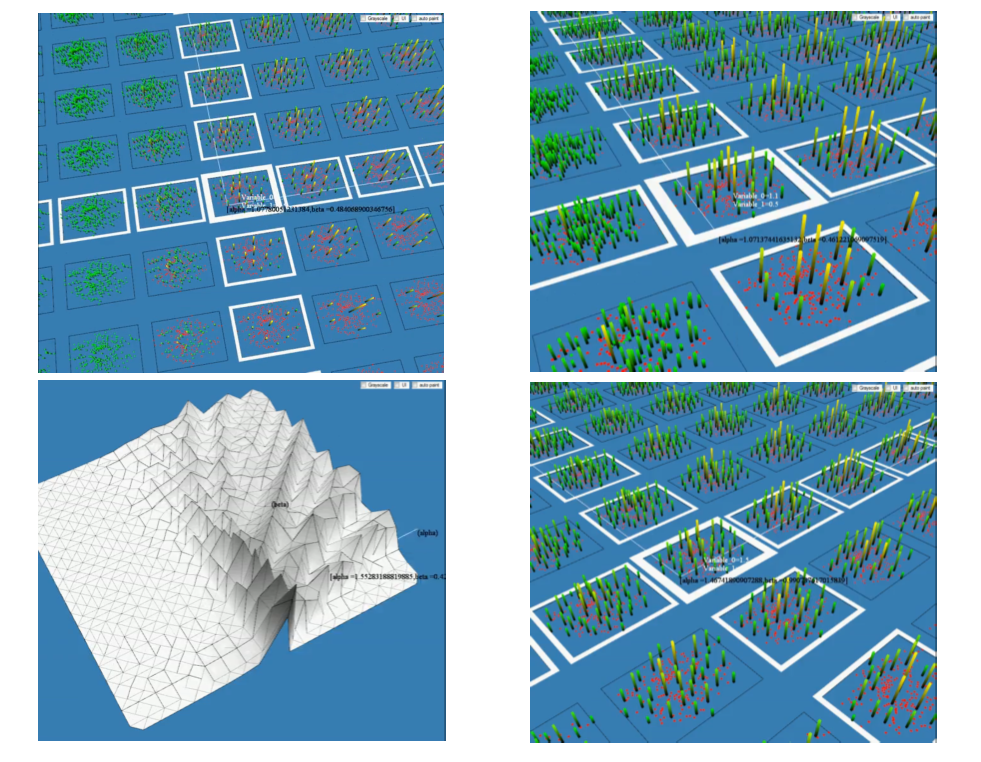
In this model by Alan Wilson and Joel Dearden, the slow scale evolution of retail space in cities is simulated. I won’t go into the technical details of the model, but the grid you see in the upper left is a set of outputs of the model. In each cell is a different equilibrium outcome showing the distribution of retail areas, and their relative size, for an urban region. This is a land-use transportation model and this surface of cells represents what physicists call a ‘phase space’ of possible outcomes.
Data from the near real-time living city can be imported directly into these models as empirical functional relationships. For example, how far people are prepared to travel on different modes of transport. We can observe these functions directly from the real-time data and bring them into this much slower scale model.
[ source ]
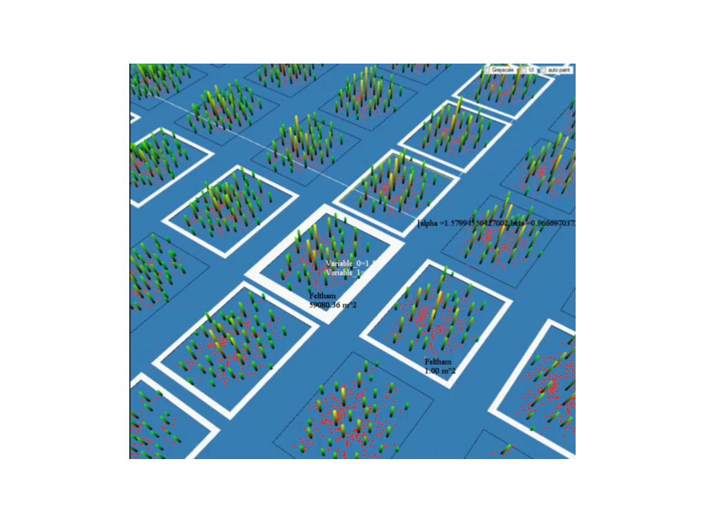
You can see here the height of each bar is the size of each retail space, and each cell is a model run. These are high streets or shopping centers - any cluster of shops. They are all competing for the custom of millions of residents. Some emerge over time and others die out. The complexity of the model means there are many equilibria and small parameter changes or planning interventions can tip the system to a different one.
[ source ]
The tool allows planners to test planning interventions, and to see how stimulating retail floor space in one location might affect other locations.
Cities are complex systems full of interconnectedness, and outcomes to even small scale interventions are unpredictable. This is why the model produces a range of possible outcomes on this kind of surface. It makes planners sensitive to the kind of complexity they are dealing with, while at the same time providing a toolkit for simulating decision making.
This is still work in progress, but shows how data from the living city might inform slower scale models. The more we know about how people actually use cities, the more we can reduce this parameter surface considerably, which will aid planners.
[ source ]
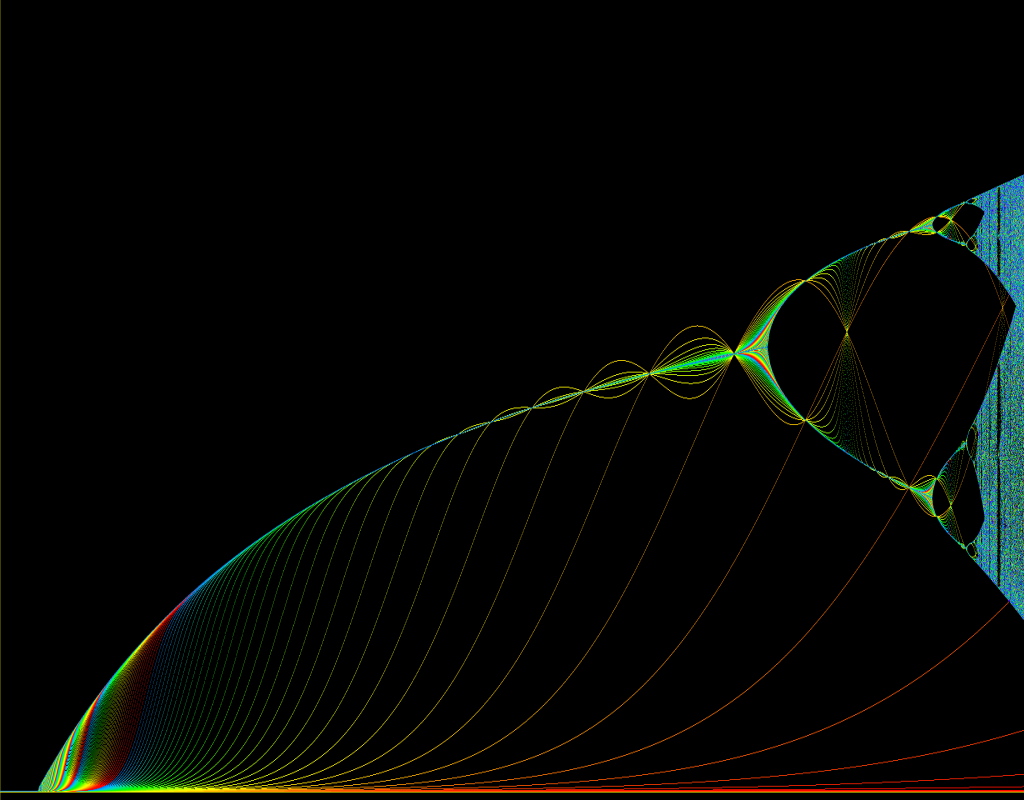
So to wrap up. This is a bifurcation diagram showing the disintegration of a system from one stable equilibrium, into 2, 4, then 8 equilibria and further forking into what we have on the right extreme of the graph, which we call chaos. Cities exist at the edge of this chaos.
The living city is an entity unto itself, not just simply an aggregation of people. It’s complex and highly unpredictable. But it can be made tangible using visualisation, and it is knowable through the kind of analytical research I’ve shown you today. It’s knowable in so far as the emergent processes that typify its behaviour across different time-scales can be understood, which they can. Processes such as congestion, on a small time scale, and gentrification and segregation, on a longer time scale. Processes like fragmentation, and agglomeration, which I am trying to engage with in my research.
The promise of large-scale real-time urban data is that the infrastructural city can become more responsive to the living city and vice versa. Perhaps the planned and the unplanned city can come closer together not only through better informed citizens, but also through a better informed, and more reflexive infrastructure.
As a result our cities could become more usable spaces, and I think citizens, designers, engineers, planners and researchers all have their contribution to make in achieving this.
Thank you.
See Also: Desire Path, archipelago, Agglomeration, Fragment, Fingerprint, Flowprint, Boris, Oyster, Region, Boundary, DNA, Fractal, Data
Best of the web
- Best Non Gamstop Casinos
- Non Aams Casino 2025
- Betting Sites UK
- Non Gamstop Casinos
- Casinos Not On Gamstop
- Casino Sites Not On Gamstop
- UK Casinos Not On Gamstop
- Migliori Bookmakers Non Aams
- Slots Not On Gamstop
- Casino En Ligne
- Meilleur Casino En Ligne
- Non Gamstop Casino Sites UK
- Casinos Not On Gamstop
- UK Casino Not On Gamstop
- Migliori Casino Non Aams
- Casino Sites UK
- Non Gamstop Casinos
- UK Casino Not On Gamstop
- Casinos Not On Gamstop
- Online Slot Sites UK
- Casino Sites Not On Gamstop
- Non Gamstop Casinos UK
- UK Casino Sites Not On Gamstop
- Slots Not On Gamstop
- Slot Online Migliori
- Non Gamstop Casino
- Casino Crypto En Ligne
- Casino En Ligne Crypto
- Paris Sportifs Belgique
- Meilleur Casino Belgique
- Casino Non Aams Sicuri
- 씨벳 먹튀
- Malaysia Online Casino
- Casino En Ligne Bonus Sans Dépôt
- Migliori Casino Senza Documenti
- Casino Italiani Non Aams
- Siti Di Scommesse Non Aams
- Casino En Ligne France
- Casino En Ligne Qui Paye Le Plus
- Migliori Casino Non AAMS
- Meilleur Casino En Ligne
- Migliori App Poker Per Android
- Casino En Ligne France